Reference Images
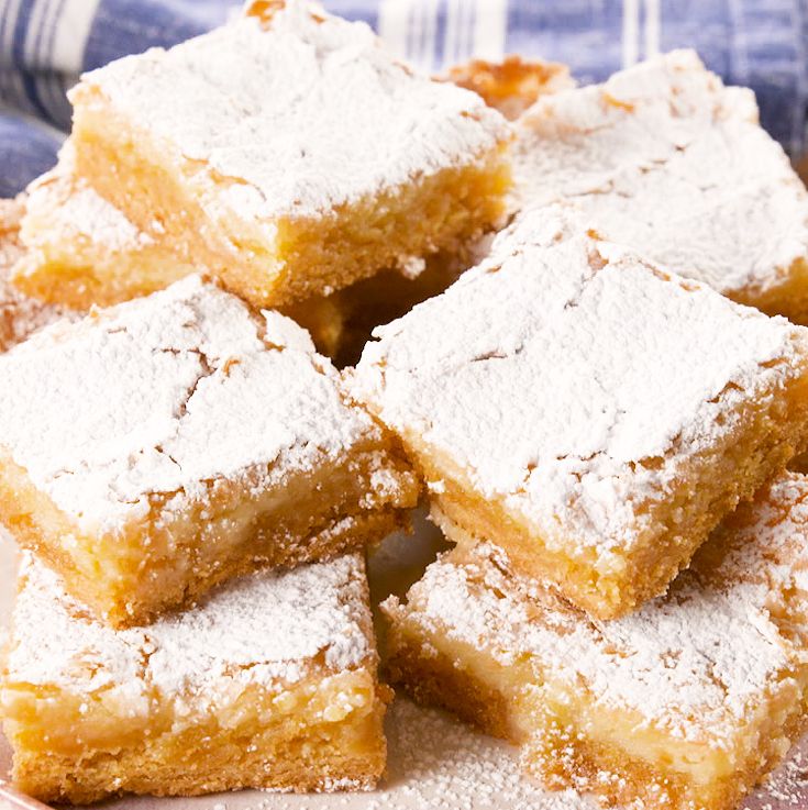
I will be drawing my own images but plan to use bold black and white food drawings in the background as well as this photo of the gooey butter cake so viewers can see exactly what the recipe looks like when completed.
Yields: 12 servings
Prep Time: 10 min
Cook Time: 1 h 10 min
cooking spray
1 box vanilla cake mix
6 tbps. butter (melted)
1 large egg
1 (8-oz.) package cream cheese (softened)
1/2 c. (1 stick) butter (melted)
2 large eggs
2 tsp. pure vanilla extract
pinch of kosher salt
1 (16-oz.) box powdered sugar, plus more for garnish
1. Preheat oven to 350° and grease a 9"-x-13" baking pan with cooking spray. In a large bowl, combine cake mix, melted butter, and egg. Press into prepared pan.
2. In another large bowl using a hand mixer, beat together cream cheese, melted butter, eggs, vanilla, and a pinch of salt. Add powdered sugar and beat until smooth. Pour over crust and bake until golden and puffed, 40 minutes. Center should still be gooey. Let cool.
3. Sprinkle with more powdered sugar before serving.
https://www.delish.com/cooking/recipe-ideas/a26975963/gooey-butter-cake-recipe/
This recipe website works well because it functions as a slideshow. Viewers can click through to browse pictures of the recipes as well as short descriptions, then click for more info if they want. There’s also a section lower on the page that has all the slideshow contents laid out for easy access.
This site is also very effective because it has all kinds of topics that would help the viewer navigate. The recipes are categorized based on criteria such as “ways to use ground beef” or “meals under 30 minutes.” There’s also a clear hierarchy that encourages perusing of the rest of the site.
This website is super trendy and fun to look at. The layout is very clean and there are lots of images of the food. There are also cute, enticing headings such as “Get Saucy” that keep the viewer engaged.
This website has super cool design elements I can incorporate such as bold colors, a very clear layout, and lots of negative space to let the information breathe. I really enjoy how the foreground and background work together, making the whole thing feel like one cohesive whole. The text alignment is also very interesting.
Much like the first example, this site is very interactive and fun to experience. The use of simple but bold typefaces clarifies the detailed imagery, and the color scheme is inviting and fits the concept of "juice pharmacy." I also enjoy how the page itself doesn't scroll; all the information you need is either in the bar at the top or the vertical slideshow.
The final example I found is packed full of information, but it's laid out in such a way to be very manageable for the viewer. The designer embraced a tetris-like grid that moves well. The color scheme also works very well and makes for a fun viewing experience.
I will be drawing my own images but plan to use bold black and white food drawings in the background as well as this photo of the gooey butter cake so viewers can see exactly what the recipe looks like when completed.